
Branding Challenge: 15 Words
Every project has its own challenges—maybe it’s a brand new product category or a name change or a merger. This one was a little more size-related. One of the first things our client said was:
The bad news is: our name is s o o o o l o o o o o n g
To be clear, when it comes to visual design, the length of a name is not insignificant. “How long could it possibly be,” you ask? We’ll tell you: Fifteen words. Seventy-five characters.
Challenge Accepted!
The National Shrine of Saint Rita of Cascia is associated with another long-time client of ours. St. Rita’s planned to adopt a new visual brand more closely aligned with the one that's been established and that we’re very familiar with. But the challenge still remained: can we take all of those words and make them legible while also assigning the proper emphasis and hierarchy?
Originally, the name was laid out like this:

Making adjustments to include the full formal name and to more closely align the brand with the Augustinian Province of St. Thomas of Villanova, the new layout looks like this:

*whew* We did it! Using different type sizes, styles, and weights to build a hierarchy, we were able to design a legible and effective layout even with a very long name.
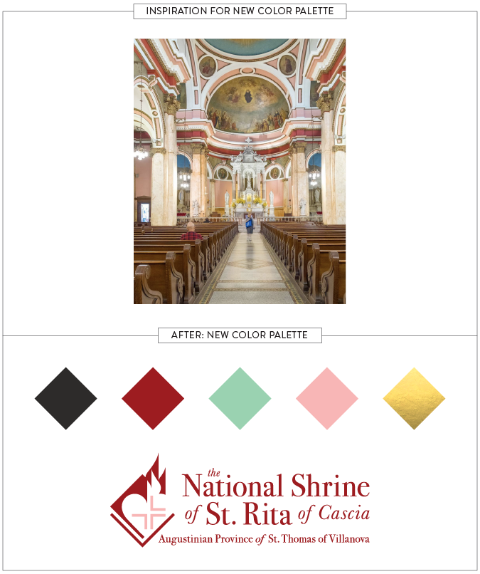
Once the layout was established, it was time to apply color. The client asked us to pull inspiration from their beautiful church interior and the resulting color palette is unique and perfect for them.
We are very pleased with the new look which gives proper weight and reverence to the Shrine. And what did our client think?
I wish you could have seen my face when I opened this document #Christmasmorning
We’ll call that a job well done!