
Brand and Packaging Design: Hollow & Ridge

People often ask us how our identity design process works — where do our logo ideas come from and how do our sketches evolve to become that final mark? While each client is unique and no two processes are exactly alike, we do have in place a reliable (and ever-evolving) system that carries us from concept through to completion. To give a little insight into how it’s done, here’s a sneak peek into how we created the identity for Hollow & Ridge, an essential oil fragrance company based in the Main Line area of Philadelphia.
After meeting with Issa, the owner of Hollow & Ridge, to discuss her needs and vision for the company, she then completed a discovery document for us. Our discovery document asks a lot of questions, such as, “What are some adjectives that describe your brand (or what you would like your brand to be)?” and, “Who is your target customer? Describe him or her, including age, aspirations, and interests.” This allows our clients to really pinpoint their place in their respective market, and it helps us immensely to understand what the client needs as we begin the design process.
We find that our strongest work comes from collaboration. It’s not uncommon for all three of us to work on concepts and pass them back and forth to refine and perfect. Each of us finds different inspiration in our clients’ discovery responses, which only improves our concept exploration process. We then narrow down our favorites to share with the client. Below are the concepts that we initially presented to Issa.

We like to show our initial design concepts in grayscale so clients aren’t distracted by color before evaluating the strength of each individual concept. Once we do introduce color palettes, we like to share the different ways those colors can be used and what we’d suggest as primary colors.

Issa chose her favorite design — the hand-drawn type solution that we think is a perfect representation of Hollow & Ridge and its rustic roots, inspired by Issa’s upbringing on a farm in West Virginia. In the subsequent proof rounds, we made revisions to both the design and the color palette, while also creating secondary marks for the Hollow & Ridge identity.

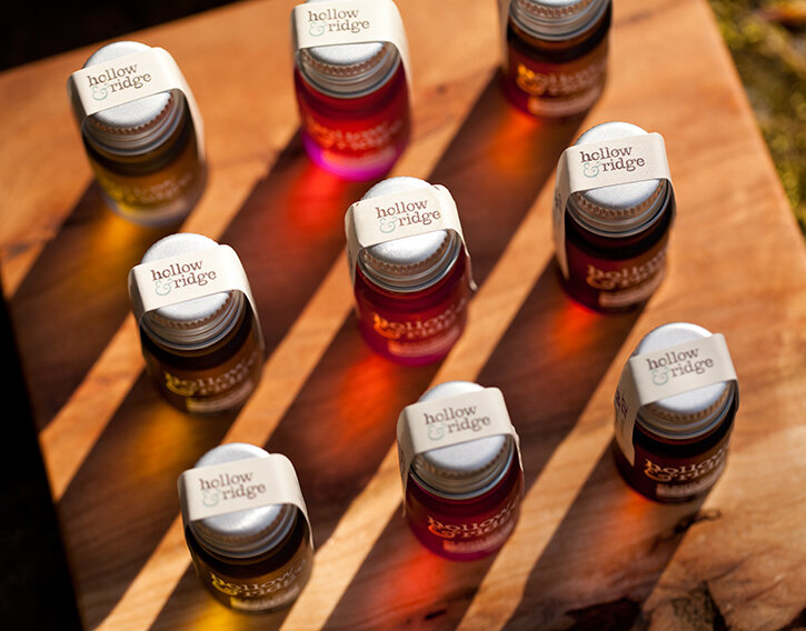
After the logo and color palette were finalized, we moved on to creating bottle designs for Hollow & Ridge’s essential oils. Issa chose darker colored bottles which reminded her of hazy beach glass. While much of our work is done on a computer, when it comes to creating a piece which will be seen on a shelf and held in your hand, it’s very important to see it and handle it. That’s when good old fashioned paper, scissors, and tape come into play. The mock-ups may not be pretty, but they’re essential in finalizing type sizes, spacing, and seal measurements. The final design was screen printed on the bottles in white ink and we also created sticker seals that are individually inscribed with the batch numbers.
This is one of our favorite projects — but really, we say that about every project! It’s so amazing to be part of the evolution of a brand, and we really love the process. Working to put all the pieces together to form one cohesive identity is truly rewarding and seeing our clients’ businesses flourish is the icing on top.
photos courtesy of Trevor Dixon