
Why Hire a Professional Designer? | Waffatopia Case Study
We get it: deciding to work with a graphic design team (and choosing the right team) is a big commitment. It can be a big investment and, particularly if you’re just starting your business (or only a few years in), a scary one. Many people decide to cut corners and go the DIY route when it comes to their brand identity — anyone can design a basic logo, can’t they? And a great product should speak for itself, right? More often than not, that’s unfortunately not the case. We live in a world where new businesses pop up every day, and the ones that really stand out from the crowd are typically those that will thrive and find the most success. A polished and professional brand identity can make all the difference and set you up for huge success; a poorly executed identity can set you up for failure, no matter how amazing your product or service may be.
A great example of a company that went all in is Waffatopia, an artisan food brand that makes delicious caramelized waffles reminiscent of authentic LiegeBelgian waffles. They are sold both online in the continental US and at farmers markets in the Philadelphia area. In mid-2012, we met with owners Brian and Andrea Polizzi to discuss what kind of company they hoped to be, the overall voice and tone they wanted their brand identity to have, and the kind of product they planned to sell — all before they ever sold a single waffle. They wanted to hit the ground running from the first day they introduced Waffatopia to the world and knew that working with a professional design team would help them do that.
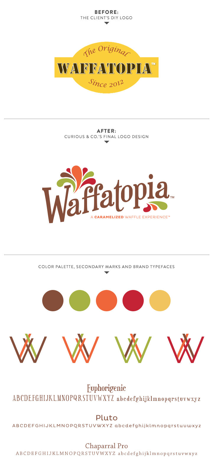
Brian and Andrea had an incredibly firm grasp on their product and were starting to develop their fun and boisterous company voice, but they did not yet have a solid visual to back it up or the design skills to bring one to life. They had created a simple mark on their own for the purpose of putting together their business plan, but it was just that: simple, and lacking a bold personality. The color palette was not extremely unique or unusual for a waffle company, and it felt a little dated. Brian and Andrea agreed that they needed something more representative of Waffatopia’s mission, product and personality, and we set off to create just that.
The result: a playful mark in a bold color palette that represents the savory and sweet waffle flavors that Waffatopia offers. The playful typography has personality, and is still legible from a distance — a very important characteristic when being sold at farmers markets. We developed secondary marks that complement the main mark, selected typefaces to best work with their identity, and then developed affordable solutions for packaging and printed materials to accommodate their startup budget (while still making a bold statement).
We initially created a simple website that reflected the Waffatopia brand identity for their launch at the beginning of 2013, and tackled phase two — a more robust e-commerce site — later in the year, after they had been working the farmers market and special event circuit for several months. Waffatopia’s responsive online storefront launched in November 2014, just in time for holiday ordering, and the orders came pouring in almost immediately. In the weeks leading up to Christmas they were at full capacity in their commercial kitchen space based on the volume of orders they were receiving. Their polished visual identity helped them to get noticed, helped to build a strong and devoted social media following, and piqued peoples’ interest in their amazing product before they even had a taste. (The fact that the waffles are amazing keeps the momentum going long after that important first impression is made!)

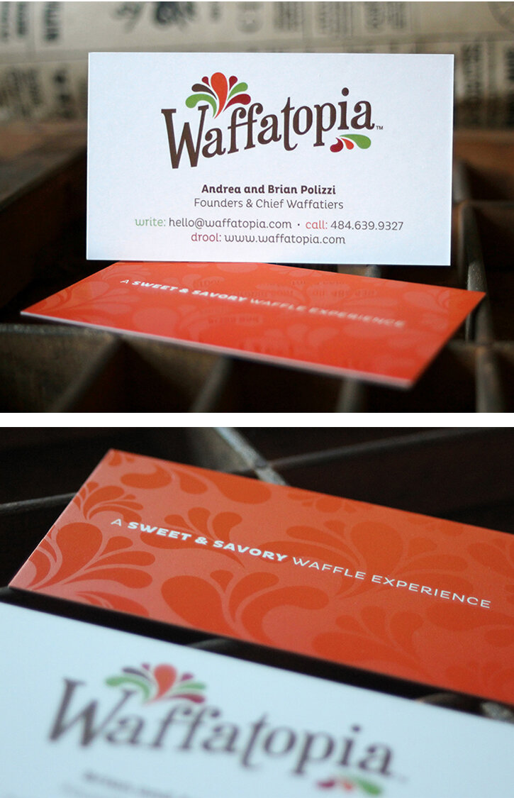
The greatest compliment they (and we) could ever receive is when Brian and Andrea are asked on countless occasions, “Is Waffatopia a franchise?” after someone has seen their sleek business card or stumbled upon their impressive farmers market display and packaging. It speaks volumes about the importance of design in driving success and taking a small startup to the level of an established brand. We don’t like to brag, but really, we can’t help it: they have told us numerous times that they simply would never have seen this kind of success without the strong visual identity we created for them, and we could not be more proud to have played a role in their amazing first year of business.
Packaging photo by Alison Conklin